March 2021 Retro
This is going to be more of a blog post behind the story of Amicu 3. But that’s what I worked on in March and will continue with in April.
Amicu

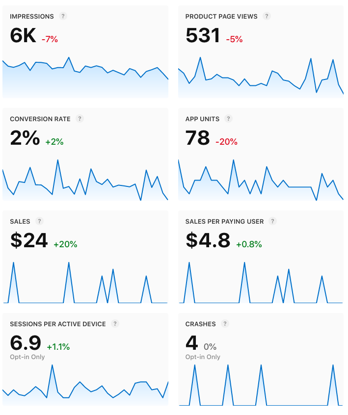
Like in February, I didn’t do much marketing. I’m focused on developing Amicu 3. Since December last year Amicu is covering its costs (besides my time). I’m happy this didn’t change in March.
What’s Amicu 3?
There’s a handful people (including myself) using Amicu daily to weekly for months. It shows the current app provides value.
But for many people it didn’t work.
This brings up two things. I can figure out why it didn’t work for those people and improve my product. And finding out for what people it works and how to reach more.
With Amicu 3 I do the first.
Amicu is helpful for different use cases. Keeping in touch, birthdays, simpler access to the main communication app per person and more.
Let’s assume people download Amicu with the aspiration to keep in touch with people. What separates those continuing to use the app from those who don’t?
They don’t form a habit.
Amicu analyzed with the Hooked model
If you’re not familiar with the Hooked modal I recommend listening to the Indie Hackers podcast episode.
1. Trigger
The reminder notifications, widget, Siri suggestions and badge number work as external triggers. Questions like „Who should I contact?“, „With whom am I losing touch?“, or „When did I last interacted with X? are internal triggers.
It’s good to look at the underlying needs and emotions of the internal triggers.
Humans seek social connection, acceptance and positive emotions:
- Catching up with positive people is energizing
- Amicu inspires initiating contact and reminds to follow up
- Setting a contact as in touch subconsciously feels like progress
- Aspiration to have a strong personal network
Avoiding pain, fear and negative emotions:
- Falling out with people
- People complaining that one forgot to reach out or reply
- Feeling guilty for not keeping in touch
- Fear of rejection
2. Action
The basic action is checking the contact list to answer the questions. Follow-up actions are e.g. reaching out to people and setting contacts as in touch.
3. Reward
The reward is being in touch. Confidence that one caught up with people. There’s potential for more here, but for now I want to keep it simple. Other habit-forming apps have streaks, goals and badges.
4. Investment
Investments are importing contacts, setting up reminders and setting contacts in touch. It adds data to the app and therefore it becomes more valuable subconsciously.
What stops the cycle?
First there’s the initial cycle with e.g. an App Store search as external trigger. There’s all the onboarding. The user has to add at least one system contact. And optionally assign a reminder.
From feedback I know that people want to evaluate the app quicker. People like adding all contacts at once or add one sample contact. Deciding a reminder frequency is not an easy decision for everyone. And this question is repeated per contact, if you don’t use a default frequency. It increases the mental load.
Users get asked, if they want notifications, but the widget as trigger source isn’t mentioned. Users have to discover it on their own. External triggers are critical until the habit is formed.
Cycles after onboarding
Time passes and a trigger brings the user back to the app. Depending on how many contacts are added, reminder frequencies and how much time passed there’s a long list of contacts with a due date.
Long lists with deadlines feel overwhelming and don’t get done. It discourages taking a first step. Chances are the user quits the app. It’s possible to skip reminders, but inexperienced users won’t know how.
There’s a fine line between feeling encouraged by a good suggestion whom to contact and being stressed. All this effects the ability and motivation to take action like reaching out or setting someone in touch.
Instead of feeling rewarded the emotions behind internal triggers work against the app. A long list makes the user feel like they neglected people.
The key problems are:
- Setting up reminder frequencies adds friction
- Missed deadlines spark negative emotions and stress
- Long lists discourage taking action
New Amicu user experience
With this in mind I sketched on paper. And then made a design concept in Figma.
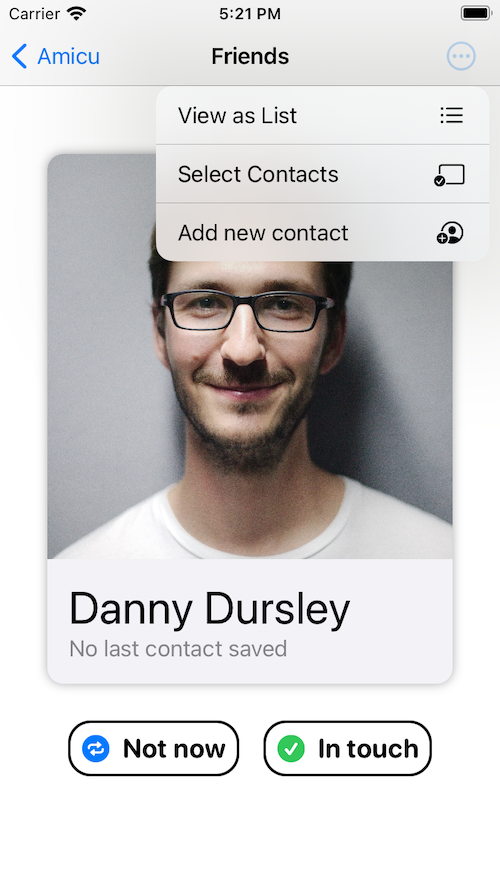
Instead of lists the main view features a swipe-able card stack. Users swipe left, if they don’t want to reach out. And right if they’re in touch. Or tap the card to reach out via communication apps.
For a ToDo app it makes sense to show deadlines, if tasks have to be completed. But Amicu is about contact suggestions.
There’s many potential reasons why a suggestion isn’t relevant at a given moment. The suggested person might not be in town or busy with a project like finishing a thesis. Swiping left makes it easy and less negative to skip the suggestion.
Seeing one card instead of a long list encourages to take a first step. And once a tiny step is done there’s momentum.
Instead of deadlines the app displays the time since the last interaction. Subconsciously the user decides, if e.g. two weeks ago feels like a good time to reach out again. Or reasonable to skip for now.
The list shows the same contact at the top. But the card stack can benefit of variable reward by randomly selecting the top card.
The design makes Amicu even simpler. And the suggestion UX is more positive and encouraging.
I want to mention another cool example of a swipe-based UX for reading web articles. Check out alfreadapp.com.
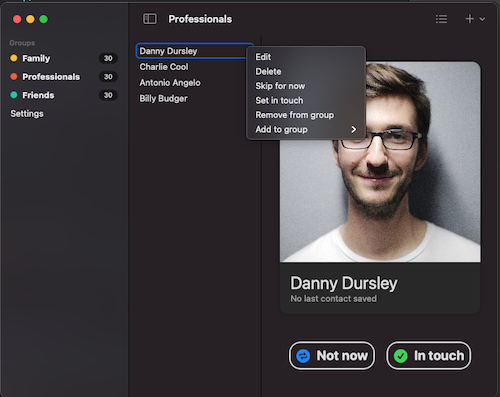
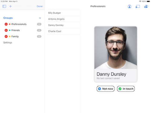
These are fundamental changes. But it can be good to take a step back and rethink everything. I’m using the opportunity to rewrite the data layer with Core Data with iCloud sync. And the UI layer as multiplatform app. The goal is to launch Amicu 3 on the Mac, iPhone and iPad and Apple Watch later.
First look at the alpha version


What works:
- Managing contact groups and contacts
- Setting contacts in touch, skipping suggestions, deleting, adding contacts to contact groups
- Runs on iPad, iPhone and Mac
Before shipping the beta I need to add more ways to import contacts.
Amicu 3 is an experimental product iteration. I didn’t yet decide, if I’ll launch it as new app or update.